Moving billboards on wheels represent one of advertising’s most dynamic opportunities. Bus advertising and branding transforms ordinary public vehicles into powerful marketing platforms that reach thousands of viewers daily across diverse routes and demographics. Unlike static billboards confined to single locations, branded buses carry your message throughout entire cities, creating multiple touchpoints with potential customers during their daily routines.
The challenge lies in designing graphics that work effectively on moving vehicles viewed from various angles, distances, and speeds. A well executed bus wrap needs to communicate instantly, remain memorable, and withstand the unique demands of vehicle applications. Understanding the principles behind successful bus & public transport branding enables businesses to maximize their return on investment while creating campaigns that genuinely resonate with target audiences.
Understanding the Unique Canvas of Transit Vehicles
Buses present designers with unconventional surfaces that differ dramatically from traditional flat advertising spaces. Curved panels, windows, doors, and mechanical components create interruptions that require thoughtful layout planning. Successful transit branding works with these features rather than fighting against them, incorporating windows into designs or using vehicle contours to enhance visual flow.
Scale considerations become critical when designing for buses. What looks perfect on a computer screen may fail completely at actual size. Text that seems readable in mockups often becomes illegible from street level or to passing motorists. Professional designers create templates at full scale, testing readability from typical viewing distances before finalizing artwork. This attention to real world conditions separates effective campaigns from costly mistakes.
The three second rule governs bus & public transport branding effectiveness. Most viewers see your branded vehicle for mere seconds as it passes or while stopped briefly at intersections. Your design must communicate the essential message in this narrow window. Complex imagery, lengthy text, or unclear branding gets lost in these brief encounters, wasting the opportunity to make meaningful impressions.
Planning for Multiple Viewing Angles
Unlike billboards viewed primarily from one direction, buses are seen from front, back, sides, and even aerial perspectives in multi story urban environments. Comprehensive branding strategies address all visible surfaces, ensuring consistent messaging regardless of viewing angle. The rear panel captures following traffic attention, side panels reach pedestrians and parallel traffic, while front graphics target oncoming viewers.
Color Psychology and Visual Impact Strategies
Color choices profoundly influence how transit advertising performs in urban environments. Vibrant, saturated colors create visual pop against typically grey cityscapes, helping branded buses stand out in traffic. High contrast combinations ensure readability across lighting conditions, from bright sunshine to overcast days and nighttime street lighting. Research shows that certain color combinations like yellow and black, or white and blue, achieve superior visibility and retention rates.
Brand consistency matters, but sometimes slight color adjustments optimize transit applications. Colors that work perfectly in print or digital formats may need intensification for vehicle wraps to maintain impact when viewed through motion, distance, and varying weather conditions. Professional designers balance brand guidelines with practical visibility requirements, ensuring recognition without compromising effectiveness.
Psychological responses to color influence campaign success beyond simple visibility. Red evokes urgency and excitement, blue communicates trust and reliability, green suggests health and sustainability. Aligning color strategies with brand messaging and target audience preferences creates subconscious connections that enhance overall campaign effectiveness and memorability.
Creating Contrast That Cuts Through Visual Noise
Urban environments bombard viewers with competing visual stimuli. Your bus branding competes with buildings, signs, other vehicles, and countless distractions. Strategic contrast ensures your message rises above this noise. Dark backgrounds with light text, or vice versa, create the definition necessary for quick comprehension. Avoid similar value colors that blend together when viewed from distance or in poor lighting.
Typography and Messaging Best Practices
Font selection dramatically impacts readability on moving vehicles. Clean, bold typefaces without excessive decorative elements perform best for transit applications. Sans serif fonts generally offer superior legibility compared to serif alternatives when viewed quickly or from distance. Letter spacing requires careful consideration; too tight and words blur together, too loose and coherence suffers.
The hierarchy of information guides viewer attention to essential elements first. Your brand name deserves prominence, followed by a simple benefit statement or call to action. Contact information, while necessary, should occupy secondary positions since most viewers won’t record details from passing buses. Instead, focus on brand recognition and general awareness that drives later online searches or store visits.
Message simplicity separates successful bus & public transport branding from cluttered failures. Limit text to seven words or fewer for primary messages. Every additional word reduces comprehension and retention. Think of your bus wrap as a moving headline rather than a complete advertisement. The goal involves creating curiosity and recognition, not conveying comprehensive product details.
Strategic Image Selection and Placement
Imagery selection requires consideration of how photos and graphics appear when wrapped around vehicle curves and interrupted by windows and panels. Wide landscape images often work better than vertical formats, flowing naturally across bus sides. Close cropped faces create emotional connections but need careful placement to avoid awkward window interruptions bisecting subjects.
Product focused campaigns benefit from lifestyle contexts that help viewers imagine usage scenarios. A beverage brand might show people enjoying drinks in social settings rather than just bottle shots. Service businesses often achieve strong results with imagery suggesting benefits or outcomes rather than abstract concepts. Whatever imagery you choose must remain recognizable and impactful when viewed briefly from various distances.
Background treatments influence how foreground elements perform. Busy, detailed backgrounds compete with primary messages, reducing clarity and impact. Simplified or gradient backgrounds focus attention on key elements while maintaining visual interest. Some highly successful transit campaigns use solid color backgrounds, letting typography and minimal graphics carry the entire message with bold simplicity.
Incorporating Brand Elements Without Overwhelming
Logos require appropriate sizing and placement for transit applications. Too small and they disappear from viewing distance; too large and they overpower messaging. Strategic repetition across different panels ensures visibility from multiple angles without creating redundancy that wastes valuable space. Balance brand presence with message communication for optimal results.
Technical Production Considerations for Longevity
Material selection impacts both appearance and durability of bus wraps. High quality cast vinyl conforms smoothly to vehicle curves, while calendared vinyl suits flatter surfaces. Lamination protects graphics from UV damage, scratches, and weathering that quickly degrade unprotected prints. Professional grade materials cost more initially but deliver superior appearance and longevity, protecting your investment.
Professional installation makes the difference between stunning results and disappointing failures. Experienced installers understand vehicle preparation, material handling, and application techniques that prevent bubbles, wrinkles, and premature failure. They navigate complex curves, recesses, and mechanical features that challenge amateur attempts. The installation quality directly impacts how your bus & public transport branding represents your brand throughout the campaign.
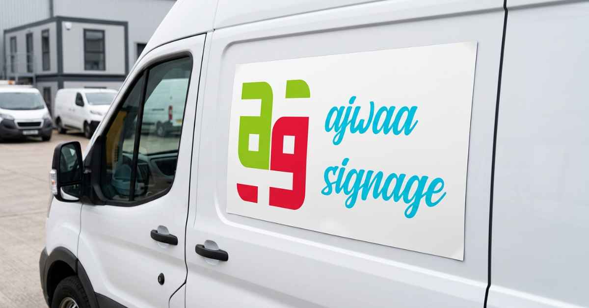
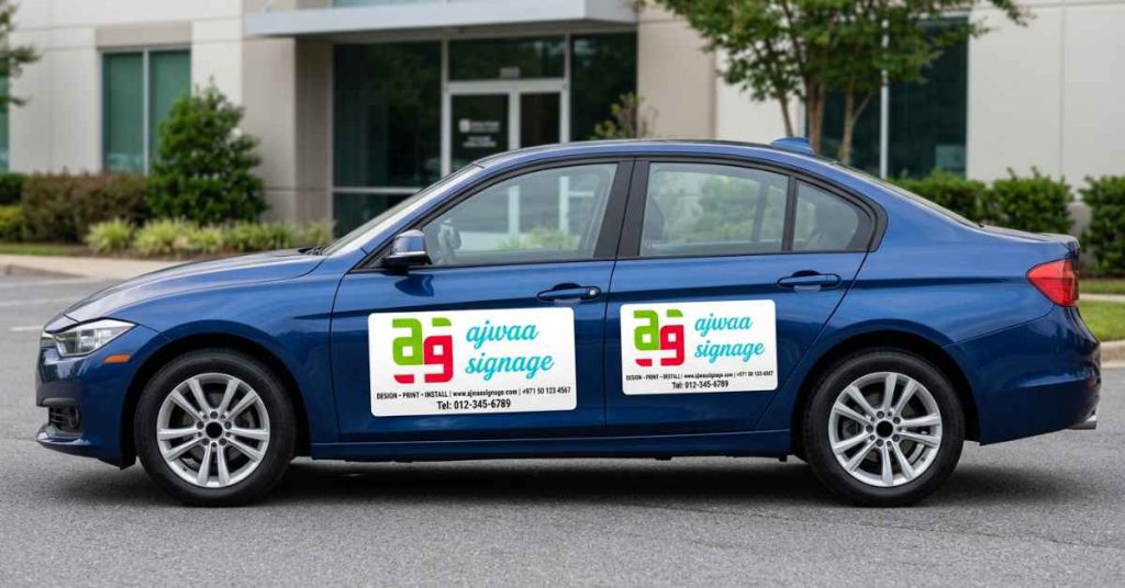
Ajwaa Signage combines design expertise with technical production capabilities to create transit branding that delivers exceptional visibility and durability. Their understanding of both creative impact and practical application ensures campaigns that perform beautifully throughout their lifespan.
Frequently Asked Questions
What design elements work best for bus branding visibility?
Bold colors with high contrast, large simple typography, minimal text (under seven words for main messages), and clear imagery create maximum impact. Designs should communicate instantly since viewers typically see branded buses for only a few seconds during normal traffic conditions.
How does bus branding differ from designing regular outdoor advertising?
Transit branding must account for curved surfaces, windows, doors, movement, and multiple viewing angles. Designs need higher contrast and larger elements than static billboards since they’re viewed briefly from various distances and while in motion through traffic.
What common mistakes should be avoided in transit advertising design?
Common errors include excessive text, complex imagery, insufficient contrast, poor font choices, and ignoring vehicle features like windows and panels. Treating buses like flat billboards rather than three dimensional moving objects leads to ineffective campaigns.
How long do professional bus wraps typically maintain their appearance?
Quality materials and professional installation typically maintain excellent appearance for three to five years depending on climate, vehicle usage, and maintenance. Premium materials with proper lamination resist fading, scratching, and weathering throughout typical campaign durations.
Can partial bus wraps be as effective as full wraps?
Partial wraps can deliver strong results when strategically designed, focusing impact on high visibility areas like rear and side panels. They offer cost savings while still providing substantial brand exposure, though full wraps maximize visibility from all angles.
Conclusion
Effective bus & public transport branding combines strategic design thinking with technical understanding of vehicle applications and viewing conditions. Success requires balancing bold visual impact with message clarity, creating designs that communicate instantly while maintaining brand integrity. By focusing on high contrast, simple messaging, appropriate typography, and strategic imagery, businesses can transform transit vehicles into powerful mobile marketing platforms that generate thousands of daily impressions. The investment in professional design and quality production pays dividends through campaigns that capture attention, build brand awareness, and drive customer action throughout their operational life. Ready to put your brand in motion? Start planning your transit advertising campaign today and discover how moving billboards can accelerate your marketing success and expand your reach across entire communities with consistent, high impact visibility.