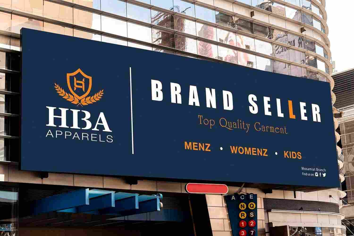
A strong visual identity begins with thoughtful signage, and the foundation of that success is a well planned best signboard design. Businesses often underestimate how much impact color, typography, and material choices can have on customer perception. Whether you are building a new storefront or refreshing your brand, understanding these elements is essential. Many modern businesses take inspiration from professional solutions like Custom Signboard Design UAE to achieve a polished and memorable presence in competitive markets.
The Role of Color in Effective Signboard Design
Color is one of the most powerful tools in visual communication. It sets the tone, evokes emotions, and helps people instantly recognize your brand. A carefully chosen palette is a key part of the best signboard design because it influences how customers feel about your business before they even step inside.
How Colors Influence Customer Behavior
Warm colors like red and orange often create excitement and urgency, while cooler tones like blue and green suggest trust and calmness. Choosing the right combination helps your signage connect emotionally with your audience.
Creating Brand Recognition Through Color
Consistency in color usage strengthens brand identity. When customers repeatedly see the same shades across your marketing, they begin to associate those colors with your business.
Avoiding Overcomplicated Palettes
Too many colors can make a sign confusing and visually overwhelming. A clean and balanced palette ensures the best signboard design remains readable and attractive from a distance.
Choosing the Right Font for Maximum Impact
Typography plays a crucial role in how your message is read and understood. The wrong font can reduce visibility, while the right one can enhance clarity and style. A successful best signboard design always prioritizes legibility and brand alignment.
Readability Comes First
Fonts should be easy to read even from a distance. Simple sans serif fonts are often preferred for outdoor signage because they remain clear in different lighting conditions.
Matching Fonts with Brand Personality
A bakery might use soft and rounded fonts, while a tech company may prefer clean and modern typography. This alignment helps communicate brand personality effectively.
Avoiding Decorative Overload
While decorative fonts can look appealing, using them excessively can reduce clarity. A balanced approach ensures the best signboard design remains both stylish and functional.
Importance of Material Selection in Signage
Materials determine durability, appearance, and long term performance. Even the most attractive design will not last without the right foundation. Choosing materials wisely is essential for a reliable best signboard design.
Common Signboard Materials
Popular options include acrylic, metal, wood, and PVC. Each material offers different benefits depending on the location and purpose of the signage.
Durability and Weather Resistance
Outdoor signs must withstand sunlight, rain, and dust. High quality materials ensure the sign remains visually appealing over time without losing its impact.
Enhancing Visual Appeal with Texture
Different textures can add depth and uniqueness to a sign. A combination of smooth and matte finishes can elevate the overall look of the best signboard design.
Combining Design Elements for a Unified Look
The true strength of signage comes from how well color, font, and material work together. A disconnected design can confuse viewers, while a unified approach creates a strong impression.
Achieving Visual Balance
Balance ensures that no single element overpowers the others. A well structured layout keeps the message clear and visually appealing.
Maintaining Brand Consistency
All elements should align with your brand identity. This consistency helps customers recognize your business across different platforms and locations.
Real World Example of Effective Design
A café using warm brown tones, handwritten style fonts, and wooden textures creates a cozy atmosphere that customers immediately connect with. This is a perfect example of a successful best signboard design in action.
Practical Tips for a Strong Signboard Strategy
Small adjustments can significantly improve the effectiveness of your signage. These practical tips help refine your design for better results.
- Use high contrast colors for readability
• Keep text short and direct
• Ensure proper lighting for visibility
• Choose weather resistant materials
• Test visibility from different distances
A thoughtful approach ensures your best signboard design remains effective in all conditions.
Frequently Asked Questions
What makes the best signboard design effective?
A strong design combines clear fonts, balanced colors, and durable materials to create a visually appealing and readable sign.
Why is color important in signage?
Color helps attract attention and creates emotional connections with customers, making the sign more memorable.
Which fonts work best for outdoor signs?
Simple and bold fonts are ideal because they remain readable from a distance and under different lighting conditions.
What materials are commonly used in signboards?
Acrylic, metal, wood, and PVC are widely used depending on durability needs and design style.
How often should signage be updated?
Updating depends on branding changes or wear over time, but maintaining freshness helps keep the best signboard design relevant.
Conclusion
A powerful best signboard design is built on the perfect harmony of color, font, and material. Each element plays a vital role in shaping customer perception and strengthening brand identity. When thoughtfully combined, they create signage that is not only attractive but also highly effective in communication.
For businesses looking to elevate their visual presence, expert guidance makes all the difference. To achieve impactful and professional signage solutions, connect with Boost Visibility with Ajwaa Signage and bring your brand to life with confidence and creativity.